White kitchens used to be trend.
Then it was white kitchens and one feature wall. At one point in time, it was kitchens or living rooms with all white and then one red feature wall. Fast forward to today – blue or two toned kitchens are all the rage.
Blue is a great color – it’s great for kitchen cabinets too.
Blue colors are inviting and they complement every tone of wood there is. If done well, it can even be used as a neutral color. It can support warm brass and stainless steel with equal success.
With that being said, we urge anyone who wants a blue/two toned kitchen to keep it simple. Try to keep it modern and clean. It is also wise not to use light hues (which are better used as accent colors) when painting your kitchen cabinets. Try avoiding turquoise ocean blue.
Follow along for some tips and tricks to make your blue kitchen a dream come true.
DO’S:
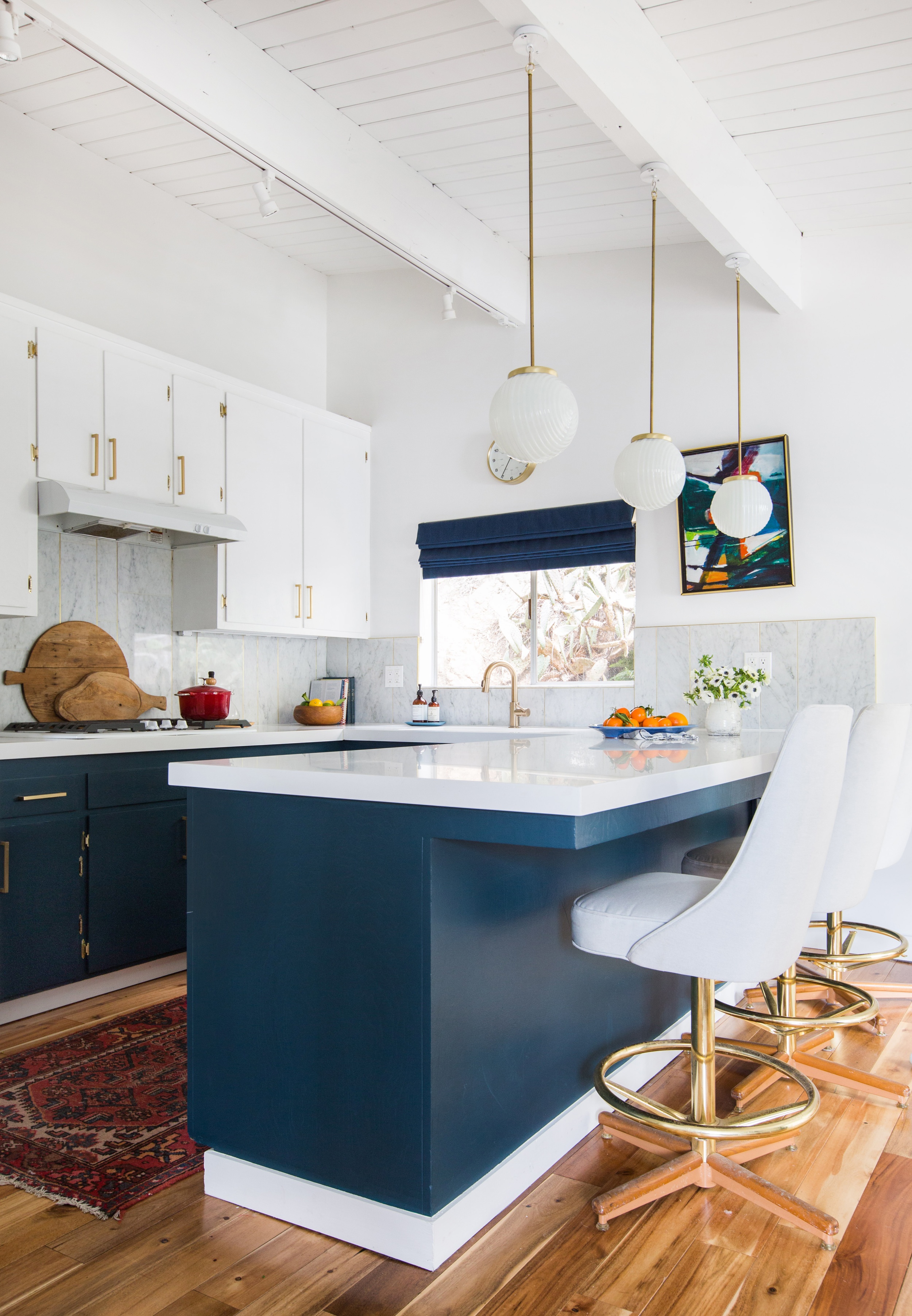
- Paint your kitchen a classic rich blue. The rich blue darker hues pull out other colors better. That way, when you add the accent colors to spruce up your house – it feel warm.
2. Keep The Tone:
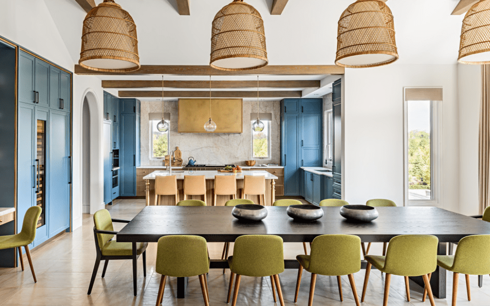
If you keep a rich blue color this is when the blue acts like a neutral color. This kitchen was able to combine walnut hues, brass and green’s which all counter balanced the coolness of the blue. A dark navy blue would have also worked well in this kitchen.
3. Keep it Classic
Keep your kitchen new looking and trendy with modern features such as stainless steel appliances and chrome finishes to match. Keep the kitchen clean and white to keep the focus on the blue cabinetry. This kitchen added pops of colors – but was able to keep the feeling and tone of the room neutral. The darker blue also provides a regal feeling to the space.
DON’TS:
4. Don’t Add Color Everywhere.
The primary colors in this kitchen make the house appear cluttered and messy. It also looks as though this would be great for a playroom – and not a kitchen.
5. Don’t attempt to stage your home with too many items in a blue kitchen.
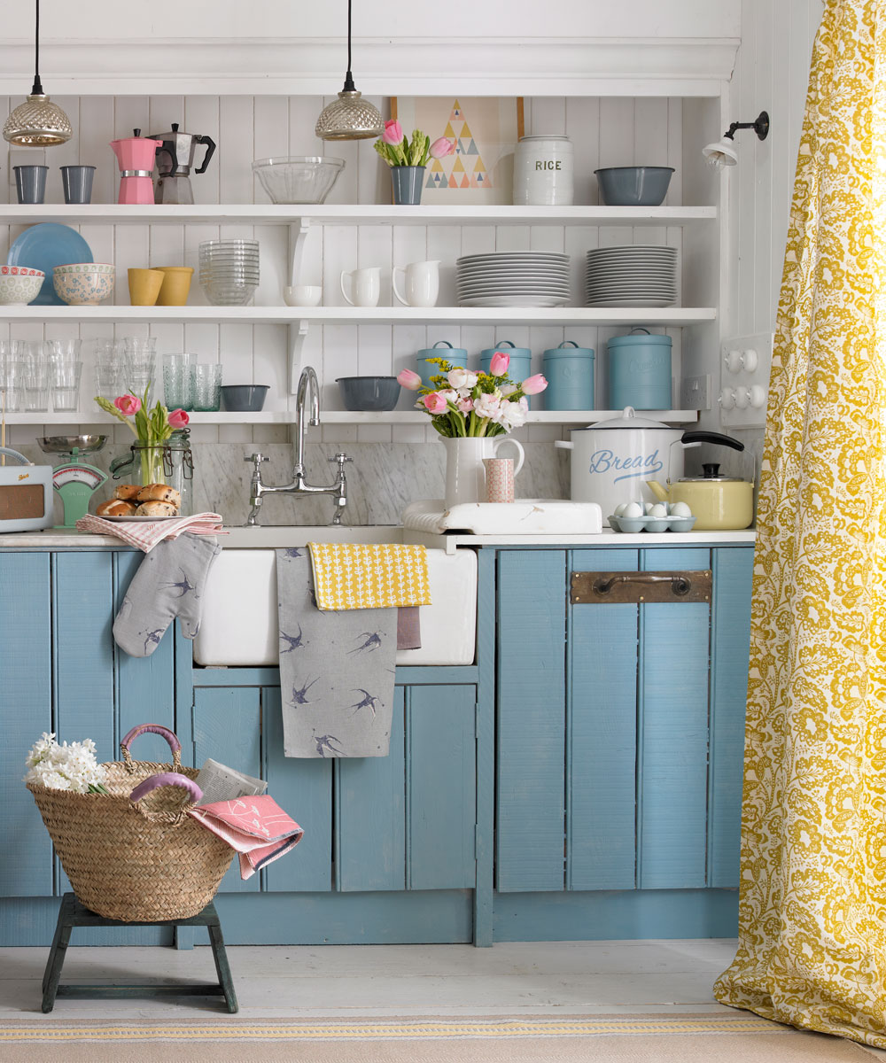
This kitchen has grey, silver, pink, yellow, green, red and purple. It’s a lot to consume and take in. The grey’s, blue’s, white’s and yellows are great. Take everything else out to balance the kitchen.
Blue is so trendy right now – a lot of commercial spaces are using them too. For a little fun, this company added “patio” lanterns and patio lighting to create a fun summer vibe in house. As you can see – it is still under production – but it’s going to look amazing!
As always, if you need help buying or selling your home – or, if you need help with pricing your call call us. Gregg Bamford or Ryan Bamford.


